


The logo that matters is not the most beautiful, but the most functional
In the world of design-and even more so when it comes to visual identity-the line between subjectivity and objectivity is thin, but crucial. Subjectivity is often the first filter through which a design is received and judged: "I don't like that font," "That color is not my style," "I find it too simple." Legitimate opinions, but not necessarily relevant in the context of a visual identity designed to represent a brand over time, in a broad and changing ecosystem.
A brand is not created to please those who commission it, but to function over time, in the marketplace, in people's heads, speaking to audiences consistently, standing out in a crowded marketplace, surviving change, and remaining recognizable everywhere, all the time. Its job is not to generate aesthetic consensus, but to build connection, recognition, and trust.
Visual identity is a tool, not an ornament. And like all tools it must be precise, designed, functional. It is not enough for it to be "beautiful." It has to be right.
Logo is not art. It is visual strategy.
A logo is not a personal expression. It is not an artistic act. It is a semiotic device designed to identify, distinguish, represent: a concentrate of meaning, accessible in a few moments, capable of becoming a symbol laden with meaning.
For this reason, the logo cannot be judged in the same way as one judges a work of art - by a subjective emotional response - but must be evaluated for its communicative functionality, for its ability to activate recognition, trust, differentiation. It must know where it will live, who it will address, what meanings it should convey, and how it can be replicated, scaled up, simplified.
Paul Rand, author of the IBM, UPS and ABC logos, said: "A logo does not sell (directly), it identifies."
And that is exactly the point: a good logo does not need to be "beautiful" in the common aesthetic sense, but to be effective, distinctive, recognizable, and consistent with the brand's values and goals.
Take the case of Nike. The very famous swoosh at its inception was just a minimal, almost crude, seemingly mundane sign. Yet today it is one of the most powerful global icons. In its simplicity it encapsulates speed, movement, energy. An archetypal, timeless form.
Or think of the Apple logo: a shape so simple that it seems almost naïve, but so strong that it supports an empire of innovation.
In both cases there is no fashion, no decoration-just essence and precise visual strategies. And it works because it does not seek approval. It seeks meaning and strategic clarity.
Objectivity: the real strength of a brand
Objectivity in design is not coldness or detachment, but design awareness. It means being able to set aside personal taste--of the designer as well as the client--to embrace a broader, more solid, more professional logic.
A visual identity only really works when it meets a set of needs that go far beyond "like." It must reflect the company's positioning, differentiate itself from the competitive environment, be recognizable within seconds, work equally effectively on a highway billboard and on a 16-pixel icon, and hold up between print and digital without losing consistency.
The Evolution of the Logo: a visual journey through time
A logo is more than just a drawing or an inscription: it is the visual signature of an era, a reflection of the aspirations, technologies and languages of its time. Through three design icons-IBM, FedEx and London 2012-we can see how the logo has transformed from a simple trademark to a powerful tool of visual storytelling.
London 2012: the strategic provocation of the 21st century
The Tradition: evolution of Olympic logos
To fully understand the London 2012 logo revolution, it is necessary to look at theevolution of the Olympic logo through the decades. The first Olympic logos were exercises in visual classicism: Athens 1896 featured a simple "OLYMPIA" inscription, while Paris 1924 introduced Olympic circles in a stylized version.
In the 1950s-80s, Olympic logos became more and more formal and academic: Melbourne 1956 with the stylized kangaroo, Rome 1960 with classical iconography, Monaco 1972 with the stylized sun. These designs reflected an era when authority and tradition were more important than popular engagement.
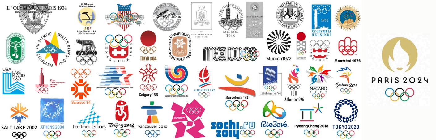
The 1990s marked an early turning point: Barcelona 1992 presented a modern interpretation of the Olympic rings, while Sydney 2000 played with the integration of the natural element. However, all these logos shared an approach respectful but often anonymous To visual communication.
The Revolution: Wolff Olins (2007)
"Breaking the Rules to Tell a City."
The London Olympics logo is perhaps one of the most hated--and at the same time one of the boldest--of recent decades. To many, it is ugly, excessive, edgy. But the point was not to make something beautiful: it was to make something that breaks.
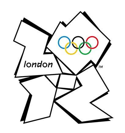
Wolff Olins interpreted London as a contemporary, young, multicultural, urban city. He designed an identity that was inclusive, vibrant, noisy. The logo then becomes an unstable, cut, fragmented structure, full of energy.
Its strength lies not in aesthetics, but in strategic coherence: that sign has become the protagonist of an integrated, declining, living communication. It was able to engage, provoke, attract new audiences.
It is proof that the effectiveness of an identity does not depend on aesthetic judgment, but on its ability to represent an idea powerfully.
In an era when brands increasingly seek to speak to values and not just needs, London 2012 marked a turning point: the logo is no longer just a symbol, but a narrative.
The Visual Echo
The success of the London 2012 logo was not measured in "likes," but in its ability to generate discussion. It became the star of campaigns, merchandise, and integrated communications, proving that a logo can be a narrative, not just a symbol. It pioneered a new approach to Olympic branding, where the value of the brand lies in its ability to generate engagement rather than immediate aesthetic approval.
FedEx: The hidden intelligence of the 1990s.
The before: 1970s-80s Federal Express
The original Federal Express logo was direct and practical, with a stylized helicopter that immediately communicated the nature of the service. It was a design of the time: clear, functional, but not very memorable. It reflected an approach to branding still tied to simply identifying the service rather than creating a visual experience.
Discovery: Lindon Leader (1994)
"The Art of the Invisible."
The apparent simplicity of the FedEx logo hides one of the most sophisticated gestures in the history of design. The arrow between the "E" and the "x," formed by the negative space, is invisible on first reading but impossible to ignore once seen. It is not decoration: it is concept.
Leader said he wanted to create a brand "with an idea inside," but one that remained accessible, readable, and uncluttered. The sans-serif typography, the compact layout, the color balance between the two parts of the name-everything was designed with clarity and functionality in mind.
And the arrow is not there to be noticed, but to work on the subconscious, reinforcing the brand message: speed, precision, direction.
In the 1990s, with the explosion of the global market and the growing importance of branding, the FedEx logo became a perfect example of how conceptual elegance could coexist with communicative effectiveness.
![]()
The Visual Impact
The success of the FedEx logo proves that a good logo can be an experience: the first time you see it, it is simple; the second time you look at it, it is striking. This duality has made the logo one of the most studied and admired in contemporary design. It has shown that design can create hidden value that reveals itself over time, turning a simple brand into a strategic branding element.
IBM: The geometric order of the 1970s
The before: IBM in the 1950s-60s
In the early years of the company, the IBM logo was still tied to a descriptive and realistic approach. It was presented with elaborate lettering and often accompanied by images of machines or technological symbols. It was a brand that said "what we do," but not "who we are." This approach reflected the industrial era in which product identification was more important than brand identity.
The Revolution: Paul Rand (1972)
"A sign that transcends time."
When Paul Rand designed the IBM logo in 1972, he was not simply "creating a sign." He was designing a system. The horizontal lines are not just a graphic quirk: they serve to communicate solidity, structure, order, technology. They are a visual summary of what IBM wanted to represent at that time: industrial power, reliability, constant innovation.
The logo is designed to work everywhere, with the same force: print, signs, electronic devices. Rand has created an identity that has not changed in half a century. A sign that does not follow trends, but transcends them. This is not the result of personal taste, but of objective design choices, calibrated to the functional needs of the brand.
In the context of the 1970s, where technology was beginning to enter businesses and everyday life, the IBM logo represented a kind of visual anchor, a symbol of stability in a rapidly changing world.
Continued Evolution
In later years, IBM faithfully maintained Rand's design, making only subtle color adjustments. This consistency turned the logo into a perennial icon, proving that good design transcends fashions. While other brands radically changed their look every decade, IBM proved that strategic consistency can be more powerful than continuous reinvention.
![]()
Building identities, not decorations
Designing a logo is only the visible part of a much larger work. Designing a visual identity means building an ecosystem, a language, a visual grammar that accompanies the brand in every expression.
An identity cannot be improvised or left to chance: it must be thought of as a modular, coherent and scalable system.